loupe.
one agent built a plain landing page for a shoot-crew app, then styled it with palletism, in about ten minutes all told. its best move was turning down palletism’s first pick.
examplesstyled with halftone press10 min 22 s
 before
see the full pages
the brief
loupe is a demo brand we made up: a calm mobile app where photographers, models, stylists and editors find each other, plan a shoot together and get hired and paid. we asked one agent to build its landing page from a reference, a real creative-collab app’s page, and to build it plain first, with no help from palletism.
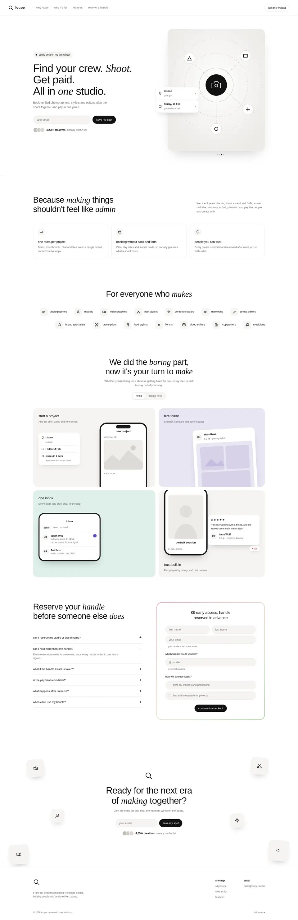
the plain page had the right parts: a hero with an email field and a photo card, three “why” cards, category chips, a bento of app tiles, a reserve-your-handle form and a closing call to action. what it lacked was a face. every spot meant for a picture held a gray box or a line icon, and the pastel tiles could have belonged to any app.
then the agent connected palletism. it asked which pack fit the page, read that pack’s guide, made four images from it and put them in. the plain page took about five minutes to build, and the palletism half took about five more.
picking a pack
palletism’s matcher reads a page’s colors and tone and scores every pack against it. for loupe it put graphite sketch first, halftone press second and pop grain third.
the matcher’s shortlist
- 1graphite sketchfirst pick
- 2halftone presschosen
- 3pop grain
the agent went with halftone press. the pack is drawn for arts portfolios and culture brands, and its subjects are analog tools: cameras, loupes, spotlights. a shoot crew handles those every day. it also lets a project set its own ink colors.
graphite sketch scored higher on calm, but plain pencil reads like a writing tool, not a place to hire creatives. pop grain was too loud for a quiet, premium app.
the matcher reads colors and tone. it does not know who the product is for, so the agent gets the last word.
colors and type
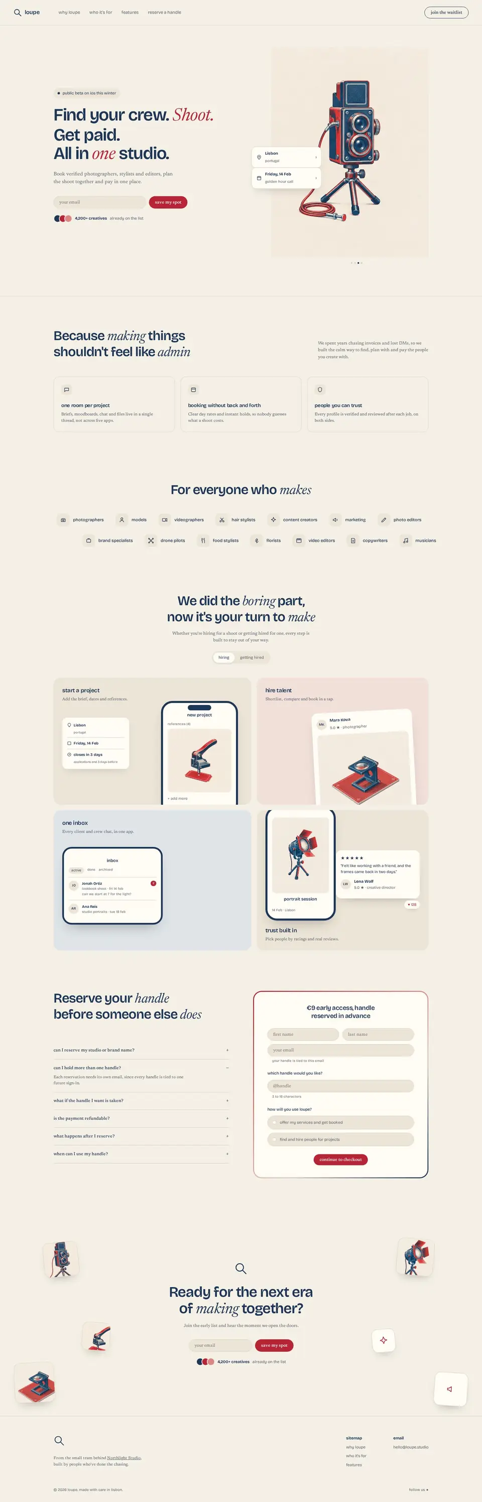
the pack came with a site palette called newsprint edition: warm cream paper, deep navy ink and one strong red. the agent set the page to the same cream as the art, so the pictures sit on the page without a frame.
headings moved to bricolage grotesque, and body text to newsreader. the red went only where the eye should land: the buttons and two words in the hero, “shoot” and “one”. the why cards, the chips and the handle form changed only in color and type, and they still read as part of the same print.
- paper#f5f0e6
- cards#fffcf6
- ink#1d3557
- quiet text#586271
- lines#d8d0c1
- red#b62435
section by section
each pair is cut from the same spot on the before and after screenshots. drag a handle to compare.
01 / 03
the hero
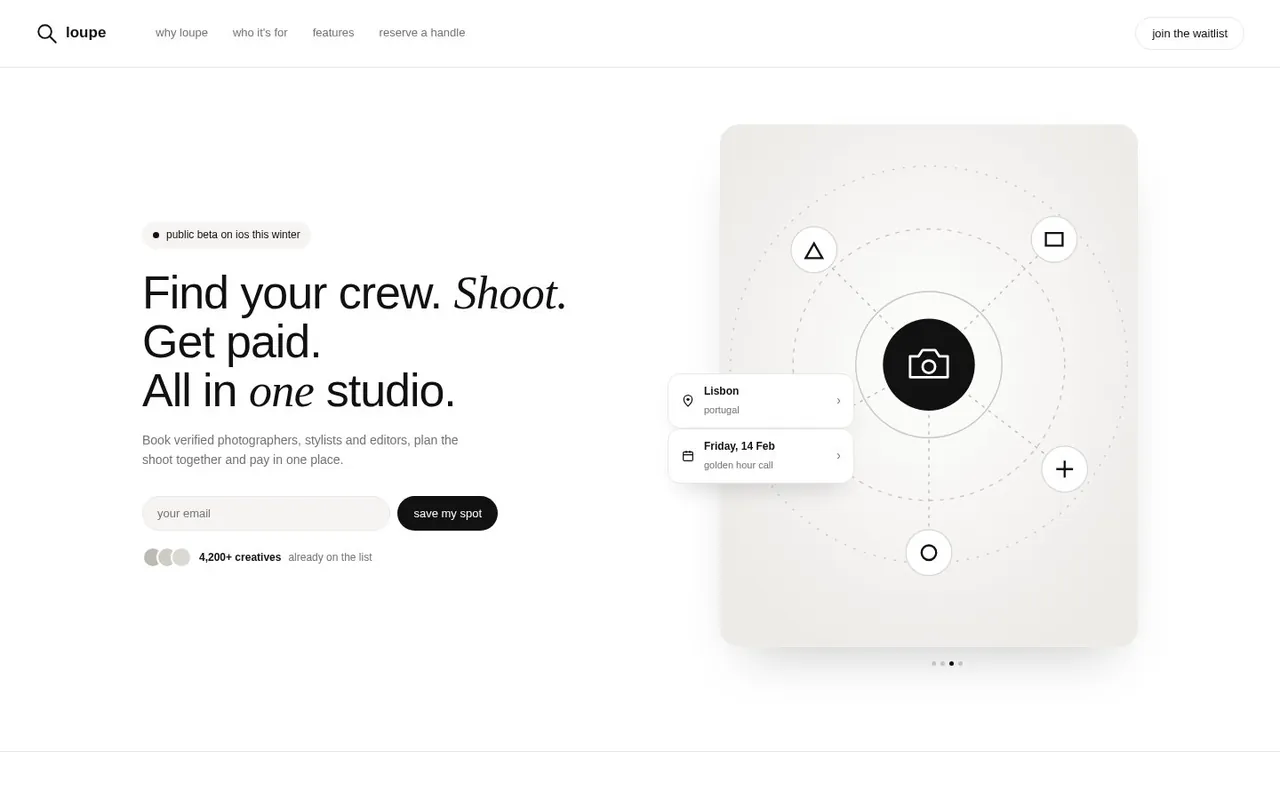
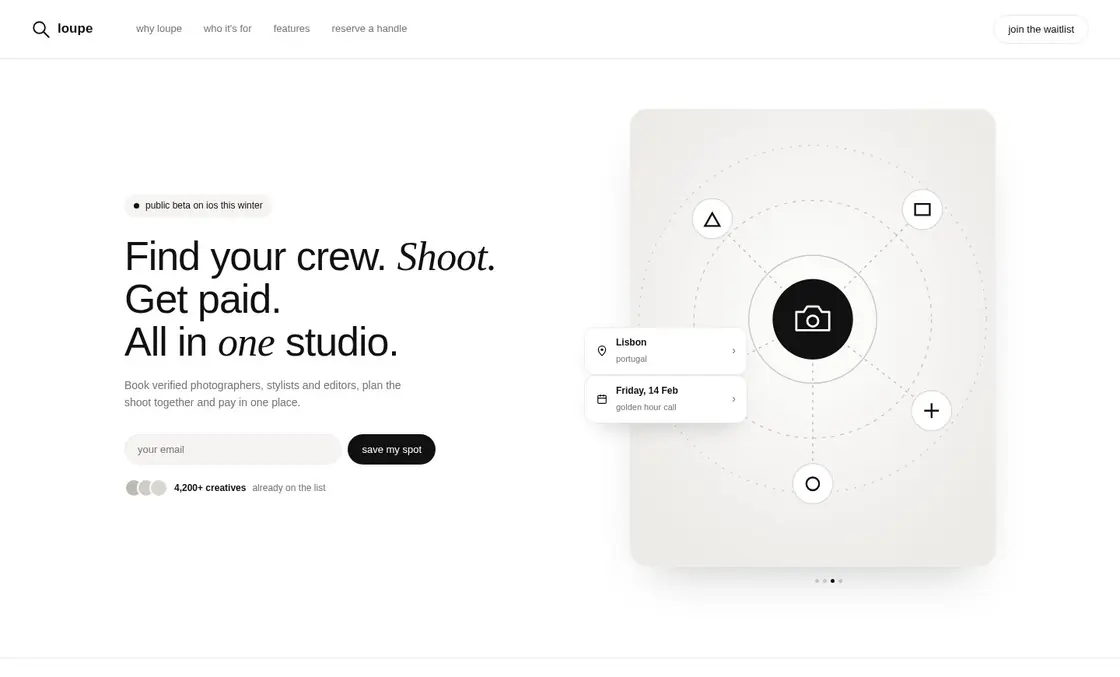
before. the right half of the hero was a gray card with a camera icon in a ring and a few floating shapes. it showed where a picture should go, not what loupe is for.
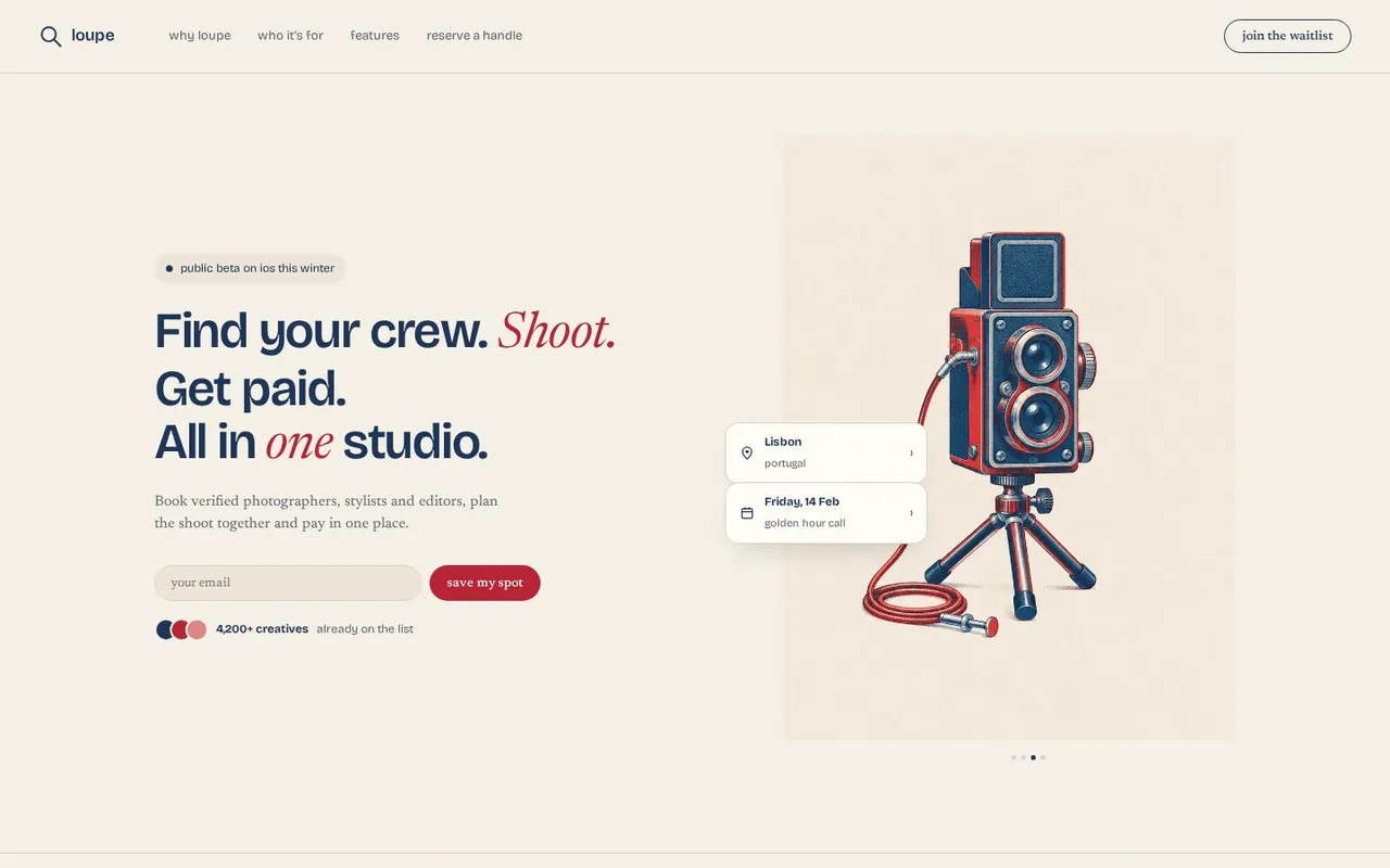
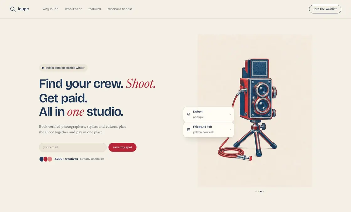
after. the card now holds a twin-lens reflex camera on a short tripod, its red cable release coiled at the foot. the small cards for the shoot’s place and date still float on top of it.
02 / 03
the feature tiles
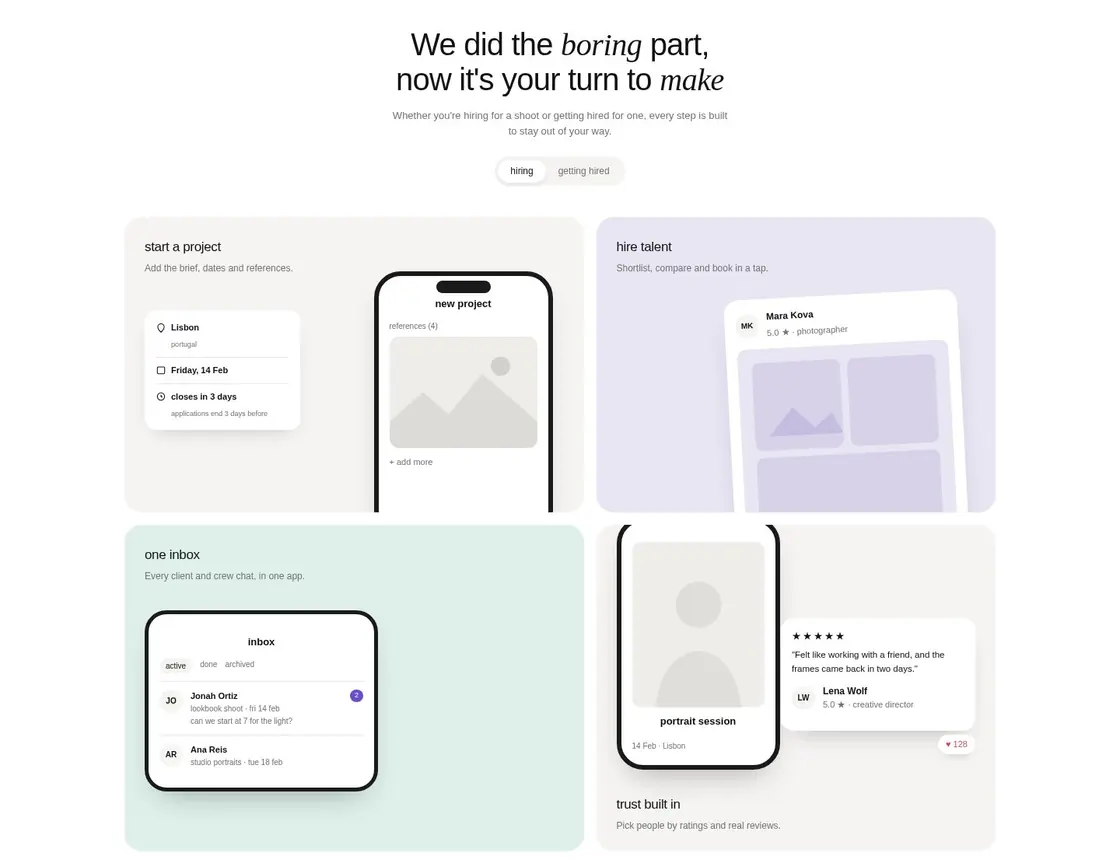
before. each of the four tiles showed a small piece of the app: a phone, a profile card or an inbox. the phones and the card held gray placeholder pictures, on lilac, mint and gray tiles.
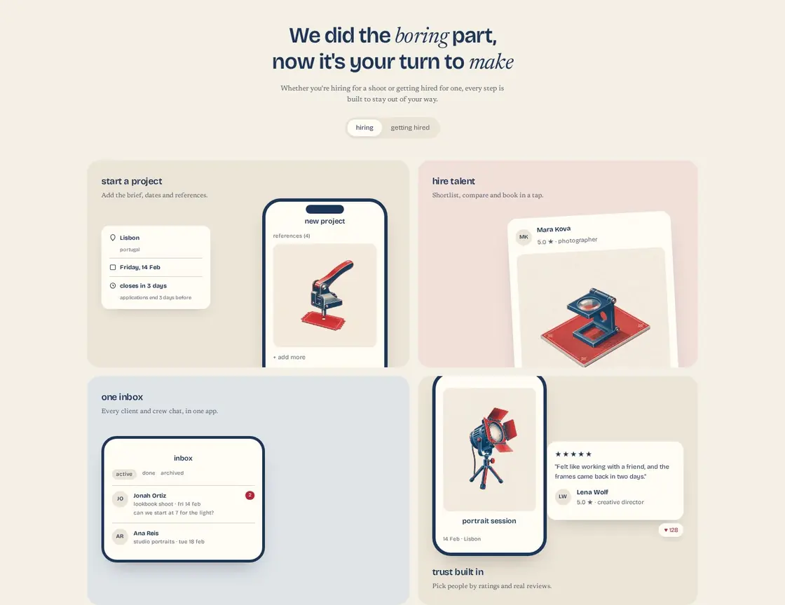
after. three tiles got a picture: a ticket punch over a blank red ticket for “start a project”, a blue loupe on a red printing plate for “hire talent”, and a theater spotlight with a red gel for “trust built in”. the inbox kept its plain list, since an inbox already shows what it does. the tiles moved to cream, rose and slate, so all four look like one print run.
03 / 03
the closing call to action
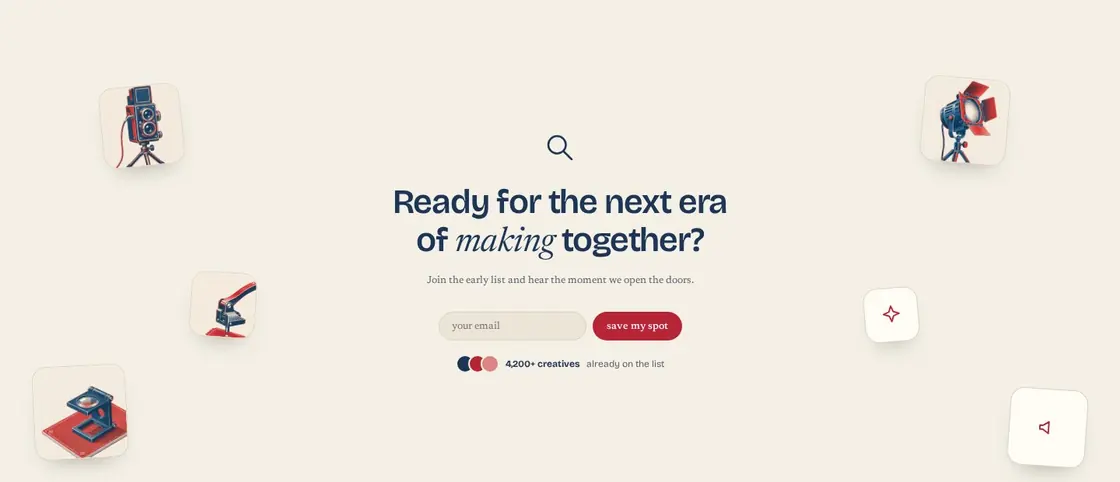
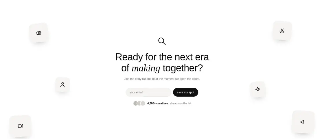
before. six small icon tiles floated around the last “save my spot” form.
after. four of them now hold the art again, cut down small: the camera, the spotlight, the ticket punch and the loupe. two still show icons, because the agent made four images for this page and no more. it is the one place where the page still looks half done.
the art
4 images made, all used. each passed the color check first try. here are the ones on the page, on their own, as the agent made them.
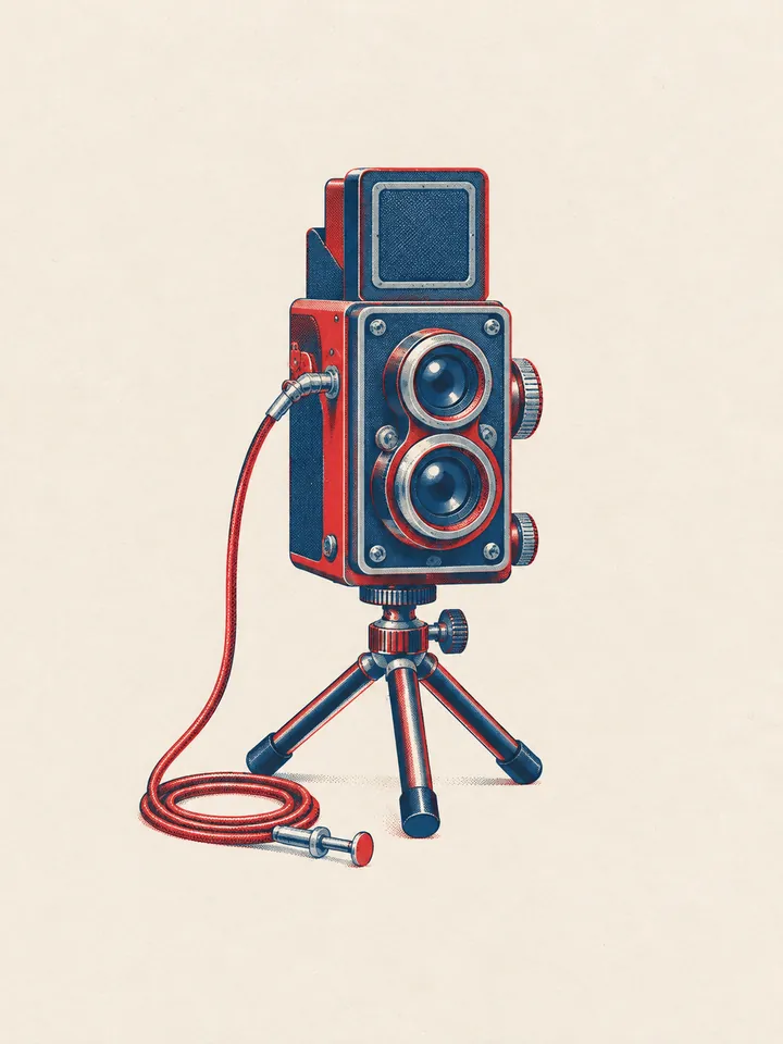
hero. a twin-lens reflex camera standing on a short tabletop tripod, a red shutter cable release coiled beside its leg. 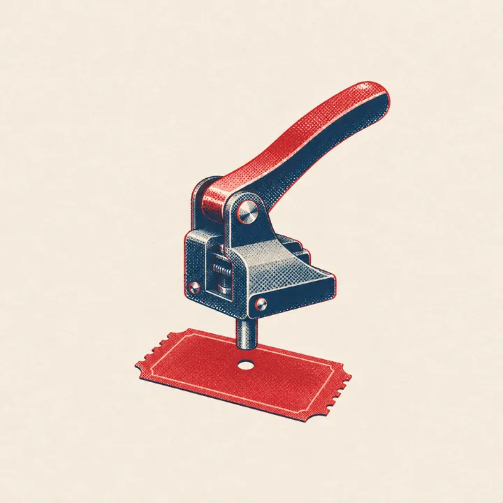
“start a project” tile. a box-office ticket punch hovering over one blank red ticket. 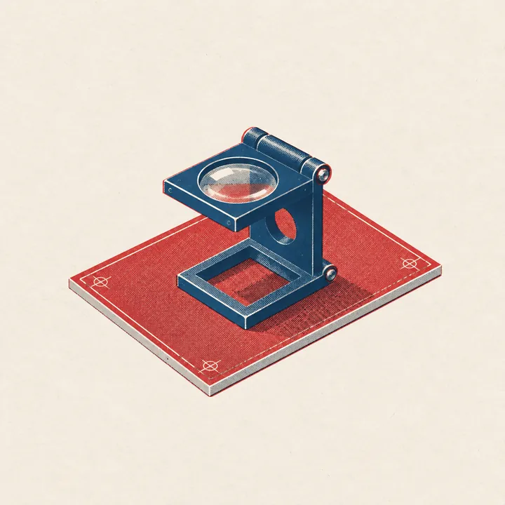
“hire talent” tile. a small blue loupe resting over one blank red printing plate. 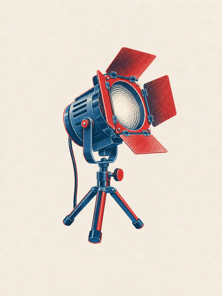
“trust built in” tile. a theater spotlight tilted upward on a low tripod, its red gel frame catching the light.
what went wrong
- on the plain page, the trust tile’s phone covered its caption. the agent let the phone size to its content before palletism came in.
- after styling, one floating tile in the closing section touched the footer line, so it moved up.
- the hero art’s cream is a touch lighter than the page, so a faint edge shows around it.
- only four images were made, so two of the six closing tiles still show icons.
- the screenshot came out 60px wider than the screen and had to be cropped.
what we took from it
the pack did the slow part. it said what to draw, in which two inks and on which paper, and all four images came back usable on the first try.
the call worth copying is the override: the top score said pencil, and the brief said cameras. next time, one image per slot would close the last gap in the closing section.
the run in numbers
- time
- 10 min 22 s, building the plain page included.
- palletism calls
- 7, out of 200 a day on the free plan.
- images
- 4 images made, all used.
- agent
- one agent, claude opus 5.5 in t3 code, with no helpers. it built the page and took the screenshots in a cloud sandbox.
- image model
- gpt-image, through the agent’s image tool. the exact version was not recorded.
- money
- not measured, for the agent or the images.
try it
connect palletism to your own agent and ask it to style a page. it can match a pack, read the guide and make art from it, the same way it did here.