tidewell.
a small team of agents built a landing page with six empty picture boxes, then filled every one with quiet pencil drawings, after turning down a 90-point match.
examplesstyled with graphite sketchabout 37 min
 before
see the full pages


the brief
tidewell is a demo brand we made up: an ai guide that gives every visitor to a website a personal product demo and onboarding. its landing page was modeled on a real ai sales-demo site: a centered serif hero, a wide art band, a logo strip, stats, a demo panel, three feature rows with chat bubbles, steps beside a ui mock, value cards, a testimonial, a faq and a closing band.
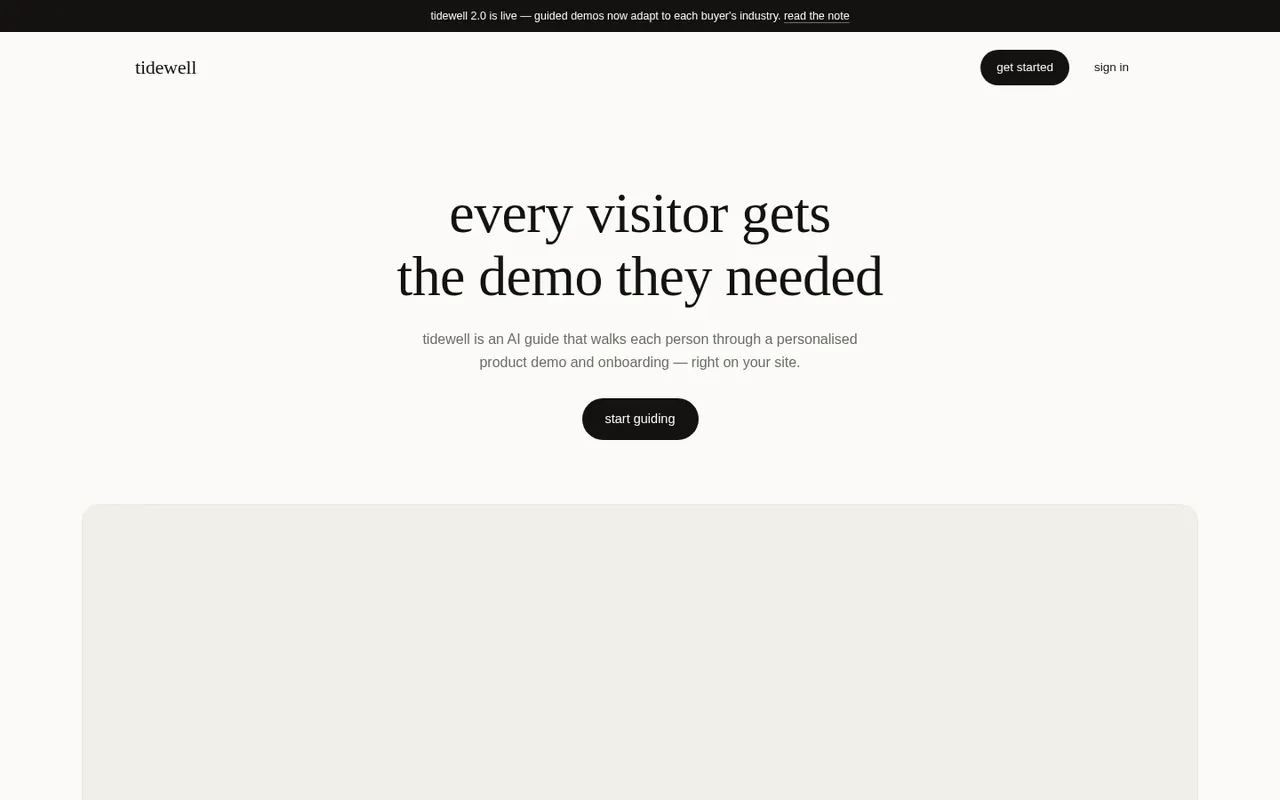
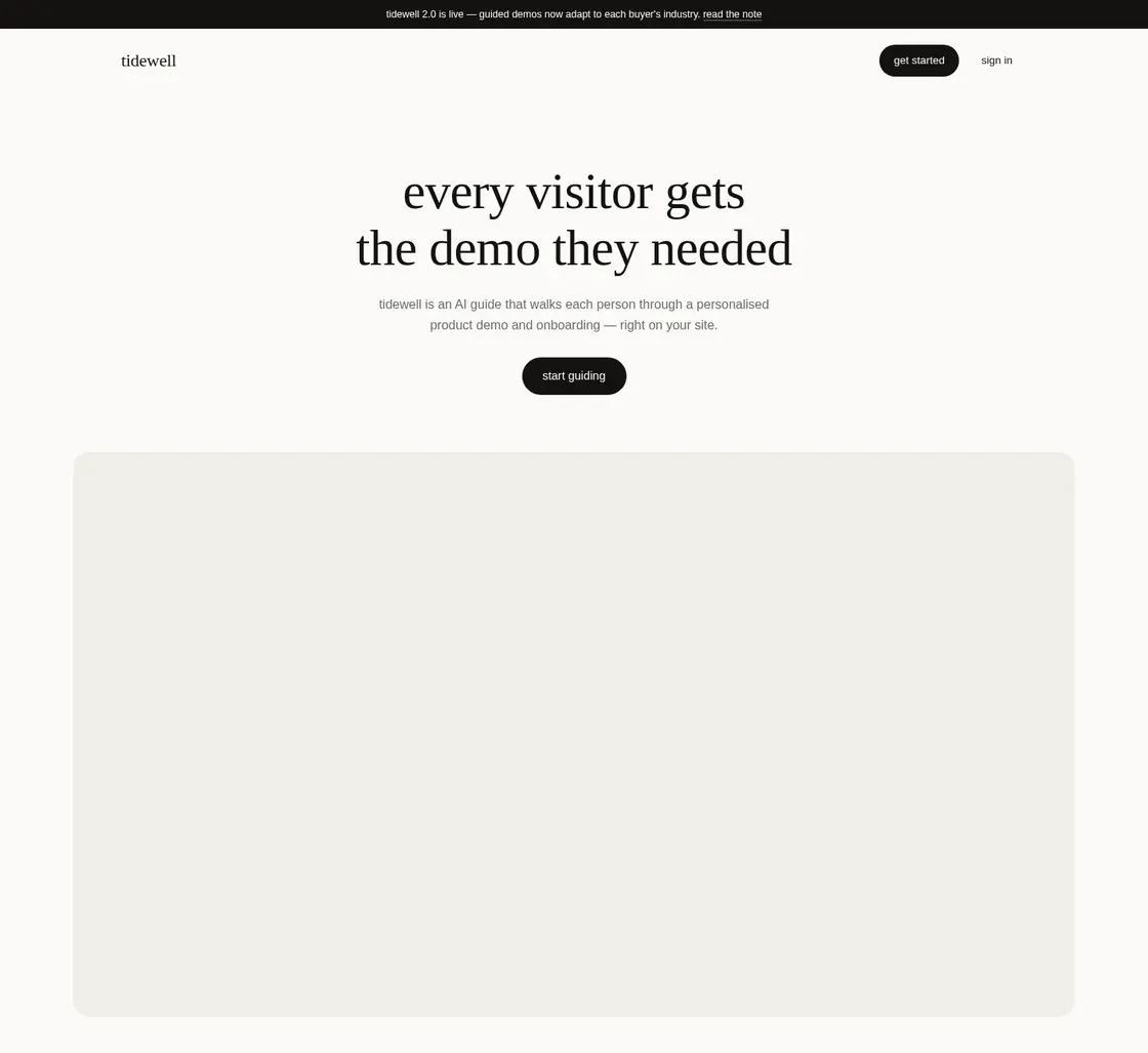
the plain page was built with no pictures at all. six dashed boxes marked where art should go, from the band under the hero to the band at the bottom. the type was tidy, but with six empty boxes the page felt unfinished.
this run used a small team. a lead agent planned the work and made the images, and smaller worker agents built the page and applied the pack.
picking a pack
the matcher’s top pick was halftone press, a strong match at 90 out of 100. it matched on color: a bright blue in tidewell’s brand colors fit the pack’s accent. pop grain and pastel playground came next.
the matcher’s shortlist
- 1halftone pressfirst pick
- 2pop grain
- 3pastel playground
- –graphite sketchchosen, not in the top three
the agent chose graphite sketch instead, a pack that was not in the top three. tidewell is a calm, premium product for businesses, and graphite sketch is the only unlocked pack made for productivity and learning tools. its airy pencil scenes on empty paper are close to the soft art on the reference page, and gray pencil sits quietly next to tidewell’s near-black type.
there was a trade. graphite sketch keeps its own gray palette, so the art does not take on tidewell’s colors.
halftone dots would have matched the blue. they would not have matched the mood.
colors and type
the page took the pack’s warm vellum palette: cream paper, a warm near-black for text and a rust accent kept for small touches like avatars and link hovers. headings moved to cormorant garamond and body text to literata.
the drawings are on white paper and the page is cream. instead of putting them in boxes, the agent used a blend setting called multiply, which makes white see-through, so only the pencil lines land on the page. there are no shadows and no frames.
- paper#f8f4eb
- cards#ffffff
- ink#2c2924
- quiet text#6e6858
- lines#e4ddcc
- rust#8a4b2f
section by section
each pair is cut from the same spot on the before and after screenshots. drag a handle to compare.
01 / 04
the hero band
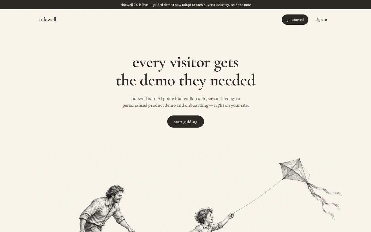
before. a big gray box with a dashed edge sat under the headline “every visitor gets the demo they needed”.
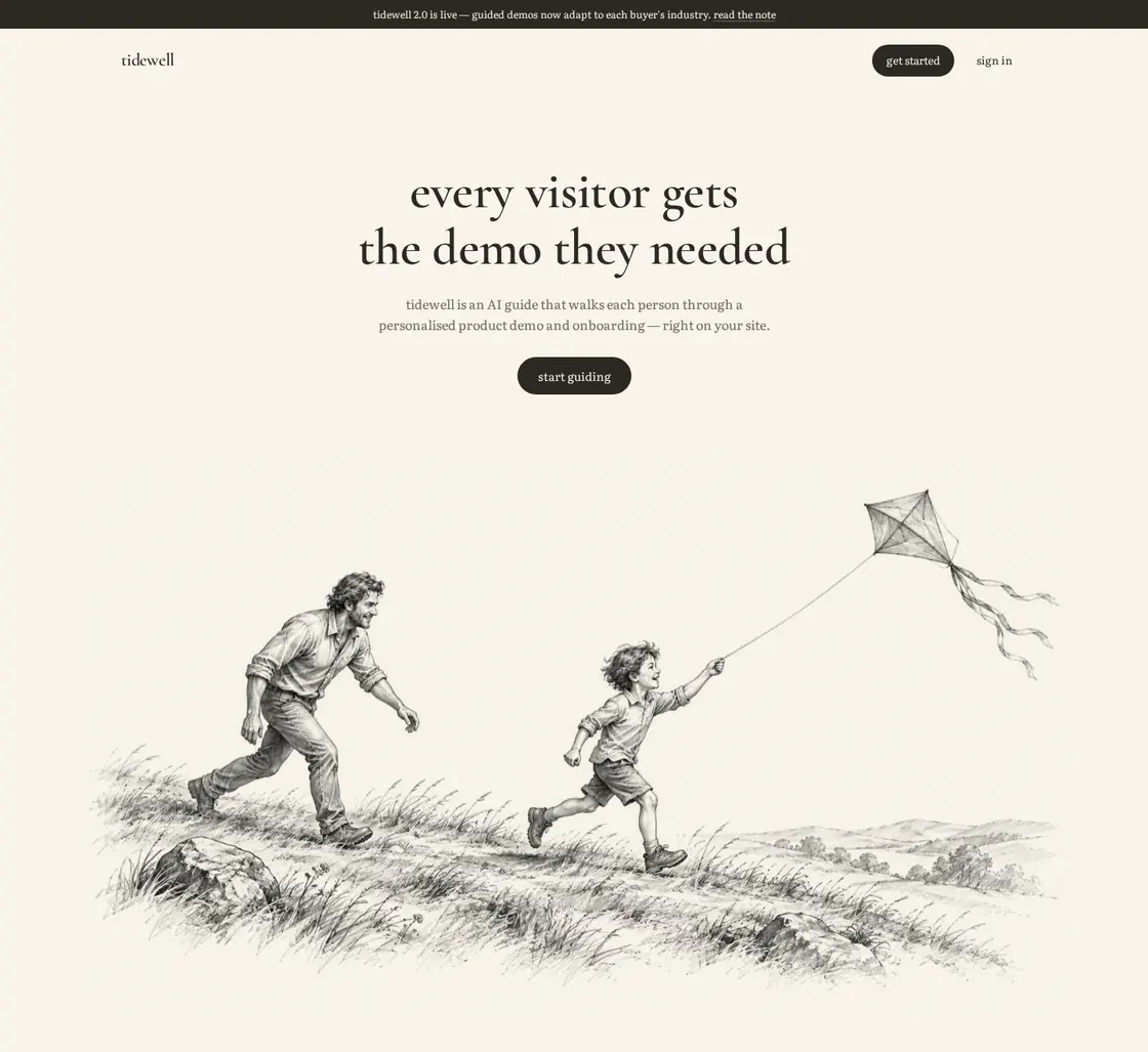
after. a child runs up a windy hill with a kite while an adult follows a step behind. it is tidewell’s promise in one picture: someone being shown the way, at their own pace. the box’s fill and edge are gone, so the drawing fades straight into the page.
02 / 04
the demo panel
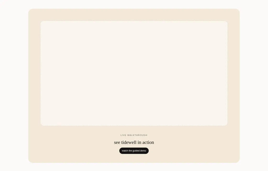
before. the panel above “see tidewell in action” was a tan block around an empty frame.
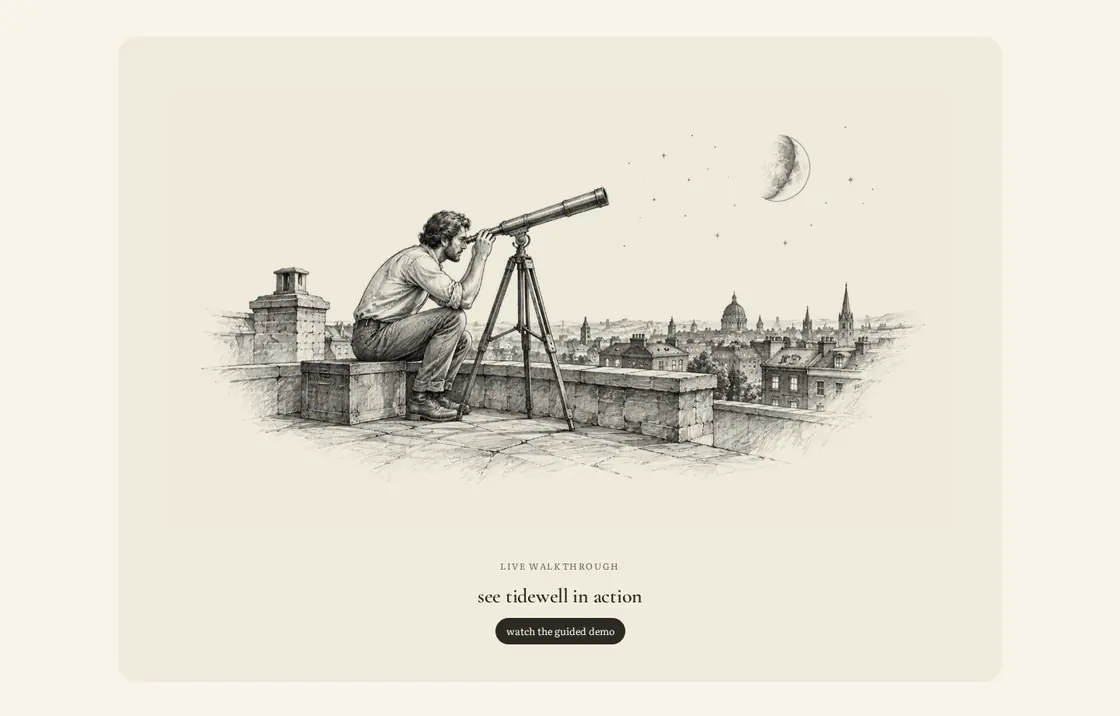
after. a person on a city rooftop at night looks through a brass telescope, which fits a product about seeing something before you buy it. the tan moved to the softer vellum fill, so the panel sits back and lets the drawing lead.
03 / 04
the three feature rows
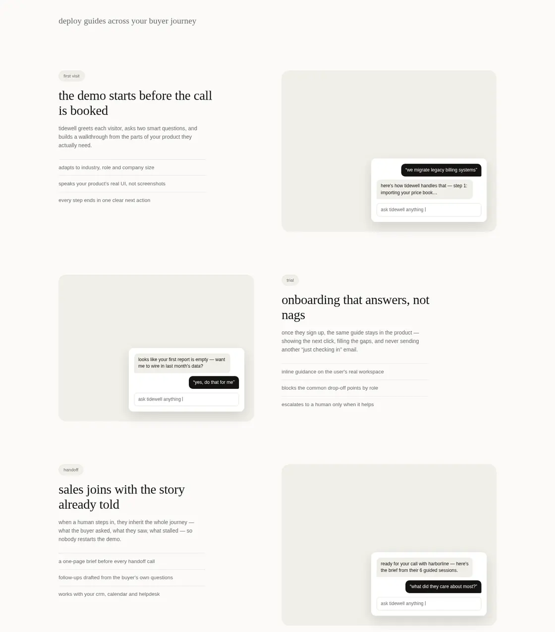
before. each row paired a short pitch with a gray box and a chat bubble on top.
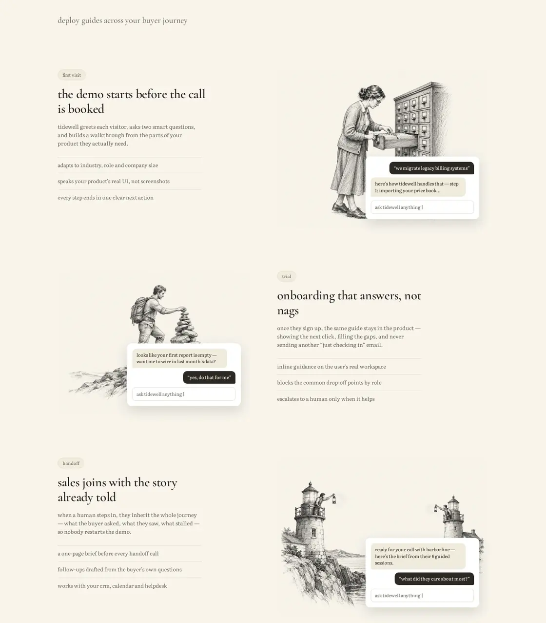
after. each row now has its own scene. a librarian searches one drawer of a tall card catalog for “the demo starts before the call is booked”. a hiker sets the last stone on a cairn for “onboarding that answers, not nags”. two lighthouse keepers signal across a bay for “sales joins with the story already told”. the chat bubbles stay on top, so the rows still feel like the product.
04 / 04
the closing band
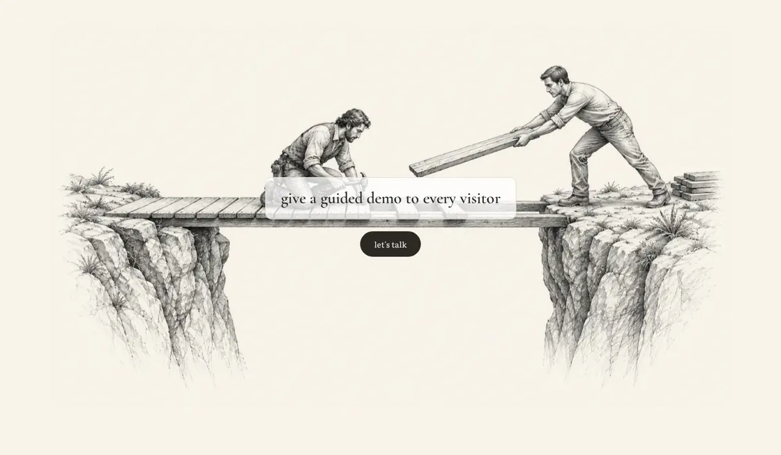
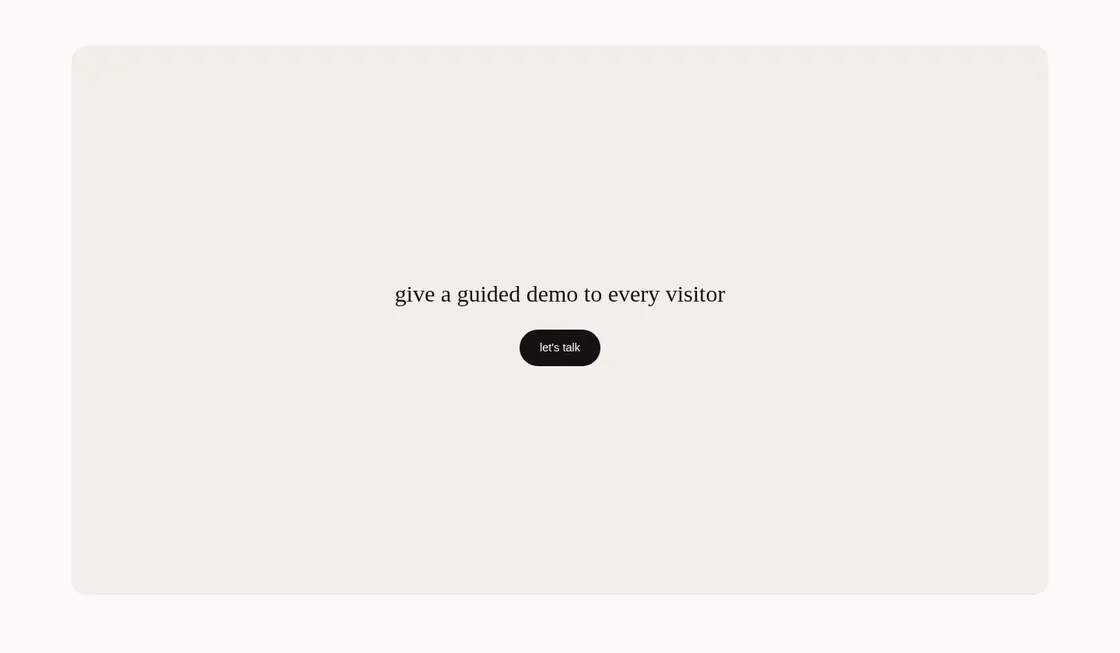
before. the last band was another empty box behind the line “give a guided demo to every visitor”.
after. two people build a narrow footbridge plank by plank between two cliffs. the drawing is busy right where the words sit, so the agent set the line on a small white paper card to keep it readable.
the art
12 images made, 6 used. each one used passed the color check first try. here are the ones on the page, on their own, as the agent made them.
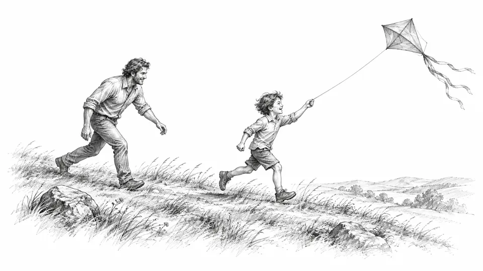
hero band. a child running with a kite string on a windy grassy hill while an adult follows. 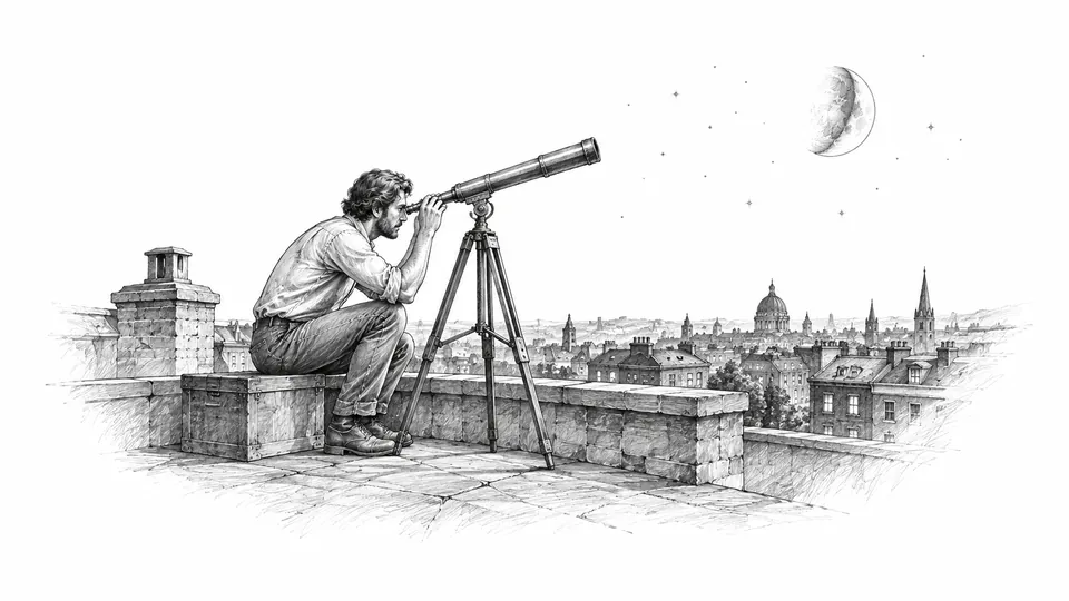
demo panel. a person on a city rooftop at night looking through a brass telescope. 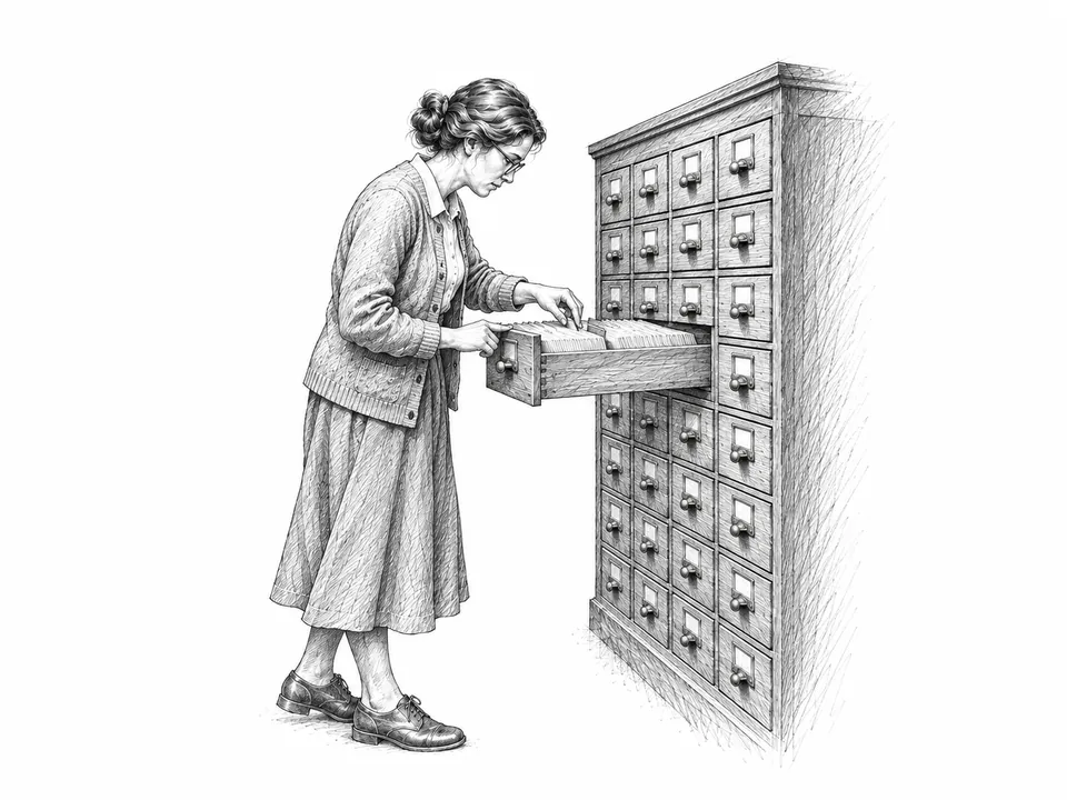
feature row 1. a librarian searching one drawer of a tall wooden card catalog. 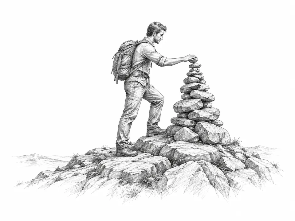
feature row 2. a lone hiker placing the last stone on a tall balanced cairn on a bare hilltop. 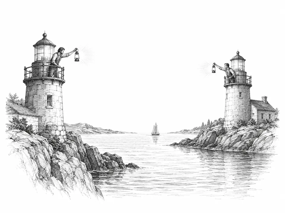
feature row 3. two lighthouse keepers signaling to each other with lamps across a narrow bay. 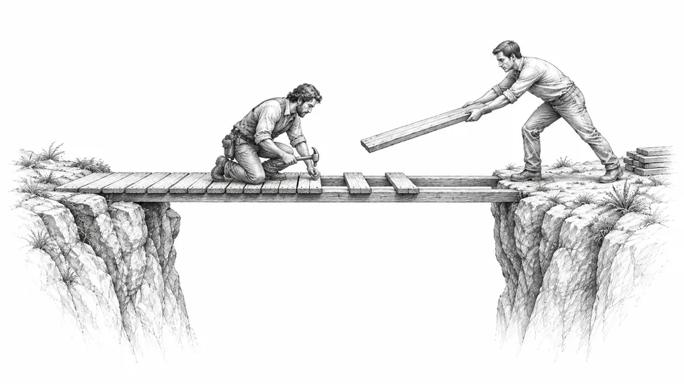
closing band. two people building a narrow wooden footbridge plank by plank across a gap between two cliff edges.
what went wrong
- twelve images were made for six slots, and six were left unused.
- a worker agent crashed once and had to be restarted.
- files sent into the sandbox in parallel collided, and four of them had to be sent again.
- screenshots kept hanging on leftover browser processes. that took 23 of the 37 minutes, and none of it was palletism.
- the closing line needed a white paper card to stay readable over the drawing.
what we took from it
the pack held across six very different scenes. every drawing passed the pack’s color check on the first try, and none was redrawn.
most of the time went to the test setup, not the styling: choosing the pack, making the images and putting them in took about eleven minutes. and again, the top score was not the right fit. the agent read the brief and said so.
the run in numbers
- time
- about 37 min, 23 min of it was screenshot trouble.
- palletism calls
- 9, out of 200 a day on the free plan.
- images
- 12 images made, 6 used.
- agent
- a lead agent, claude opus 5.5 in t3 code, with smaller worker agents, glm-5.3-flash in opencode. the workers built the page and applied the pack, and the lead made the images.
- image model
- gpt-image, through the lead agent’s image tool. the exact version was not recorded.
- money
- not measured, for the agent or the images.
try it
connect palletism to your own agent and ask it to style a page. it can match a pack, read the guide and make art from it, the same way it did here.